Cluster Details
Zooming In - By selecting a cell from a cluster graph and clicking "View Details" in View Mode, or the "View" icon from the Online View you can take a detailed look at the factors and elements of that cell. Objects can be sorted by frequency or weight.
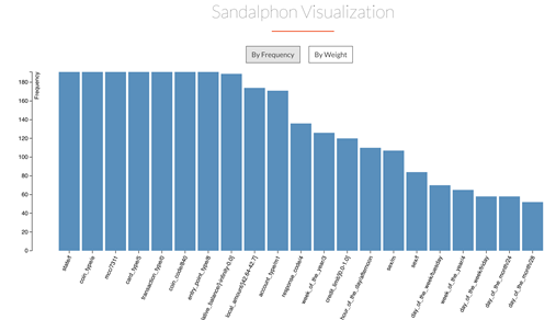
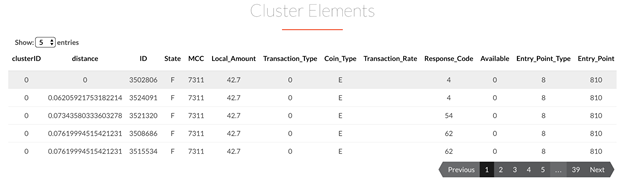
Below the Factor List you can view the list of elements in the cluster.
"Compare" mode extends the functionality of View mode, and provides a tool for information comparison between two clusters. After selecting two clusters, clicking on the Compare button displays the following comparisons.
- Feature Comparison: This is the default comparison presented. It consists of a combined bar chart that displays the information for each feature in a cluster against the counterpart in another. It's fully parameterized:
- Value of Comparison: Either Frequency or Weight value (when available)
- Scope of the clusters: Either Local or Global. simCluster clusterizes in both these scopes and produces different values to be displayed.
- Sorting Criteria: Offers four options for sorting the bars, explained below.
| Sorting | Description | Sample |
| Combined Importance | Sum of the values of the features for both clusters | 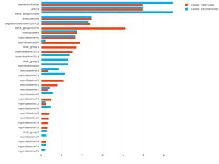 |
| 1st Cluster's Importance | Sorts the bar chart taking into account only the first cluster | 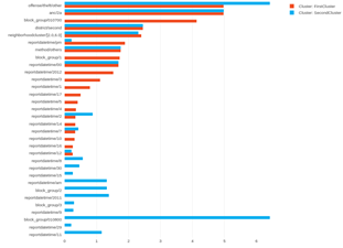 |
| 2nd Cluster's Importance | Sorts the bar chart taking into account only the second cluster | 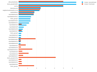 |
| Percentage Difference | Calculates and displays the difference for each feature. (The same value in both clusters would be zero percent difference.) | 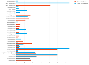 |
Single cluster information can be displayed by deselecting the cluster's name in the legend of the bar chart, too.
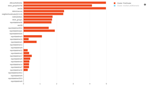 | 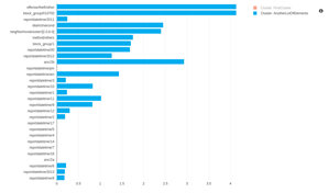 |
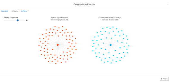
- Kernel comparison: A kernel, or core, is a subselection of a cluster, given by a percentage parameter. The kernel comparison uses a Kernel Graph, that displays the elements around the centroid of the cluster.
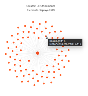
By hovering over an element in the graphic, you can see the ranking and distance to the centroid from an element.
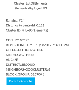
By clicking on an element in the graphic, you can see all the information retrieved from the dataset.
 |  |
The percentage of the cluster that you see in the Kernel graph is controlled by the sliding bar at the left of the graphs. As the elements stray in distance from the centroid, they become lighter and have a lower ranking. The line that connects elements to the center is scaled from the distance calculated to each element and the density of elements depends on the size of the cluster.
- Metric comparison: This comparison displays statistical distances between the features of both clusters, in all the available scopes and values.

Euclidean and Manhattan distances are available for this version of ML Studio.